MY CONTRIBUTIONS
Brand Identity + Creative Direction
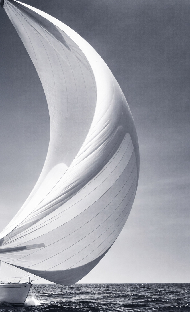
THE INSPIRATION
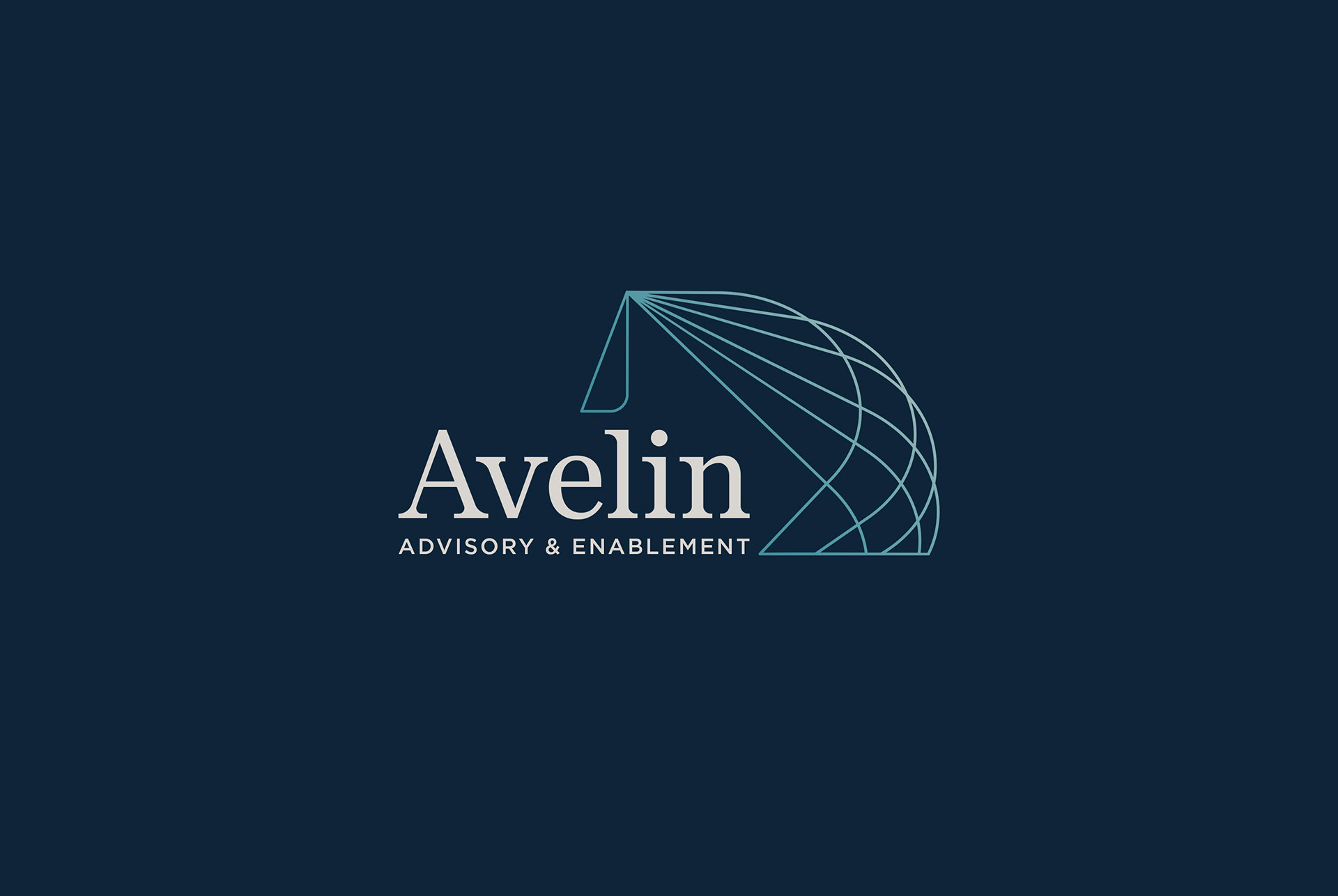
The name Avelin is formed from Latin roots: 'avel' meaning wind and 'lin' meaning thread. Together, they represent the weaving of marketing data seamlessly across all platforms into a connected system, paired with the directional force needed to navigate clients forward toward future destinations. This thinking naturally aligned with the Avelin team's desire to centre the identity around a spinnaker sail - a powerful symbol of momentum, direction and forward movement.
THE SCIENCE BEHIND THE DESIGN
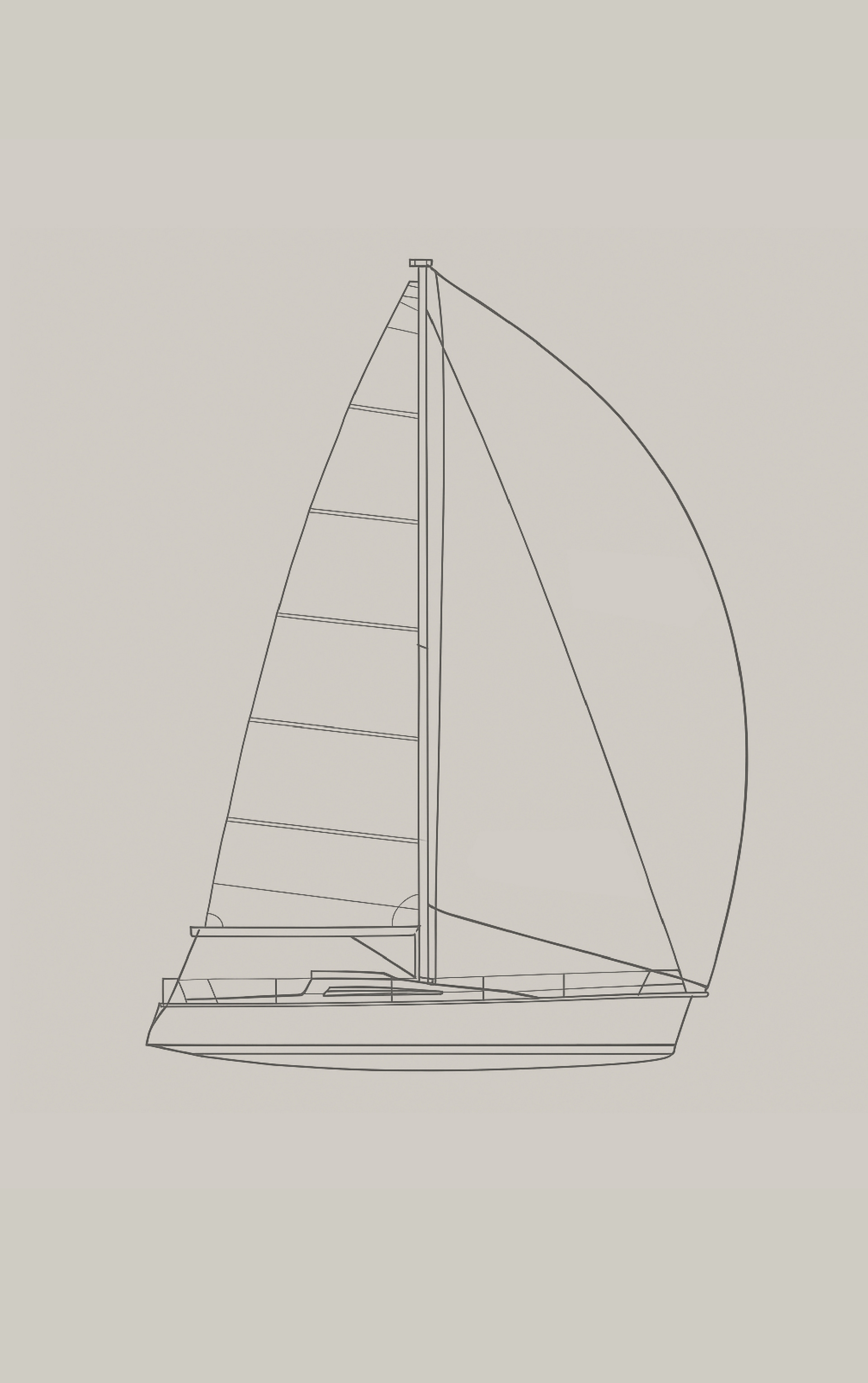
To deepen the thinking behind the spinnaker concept, I discovered through research, that using the main sail and the spinnaker together is the true mark of high-performance sailing. It's a setup that demands precision, timing and teamwork. The main sail providing control and stability while the spinnaker delivers raw speed and power. When the two sails are perfectly balanced, they create a state of peak efficiency and performance that only the experienced sailor can master.
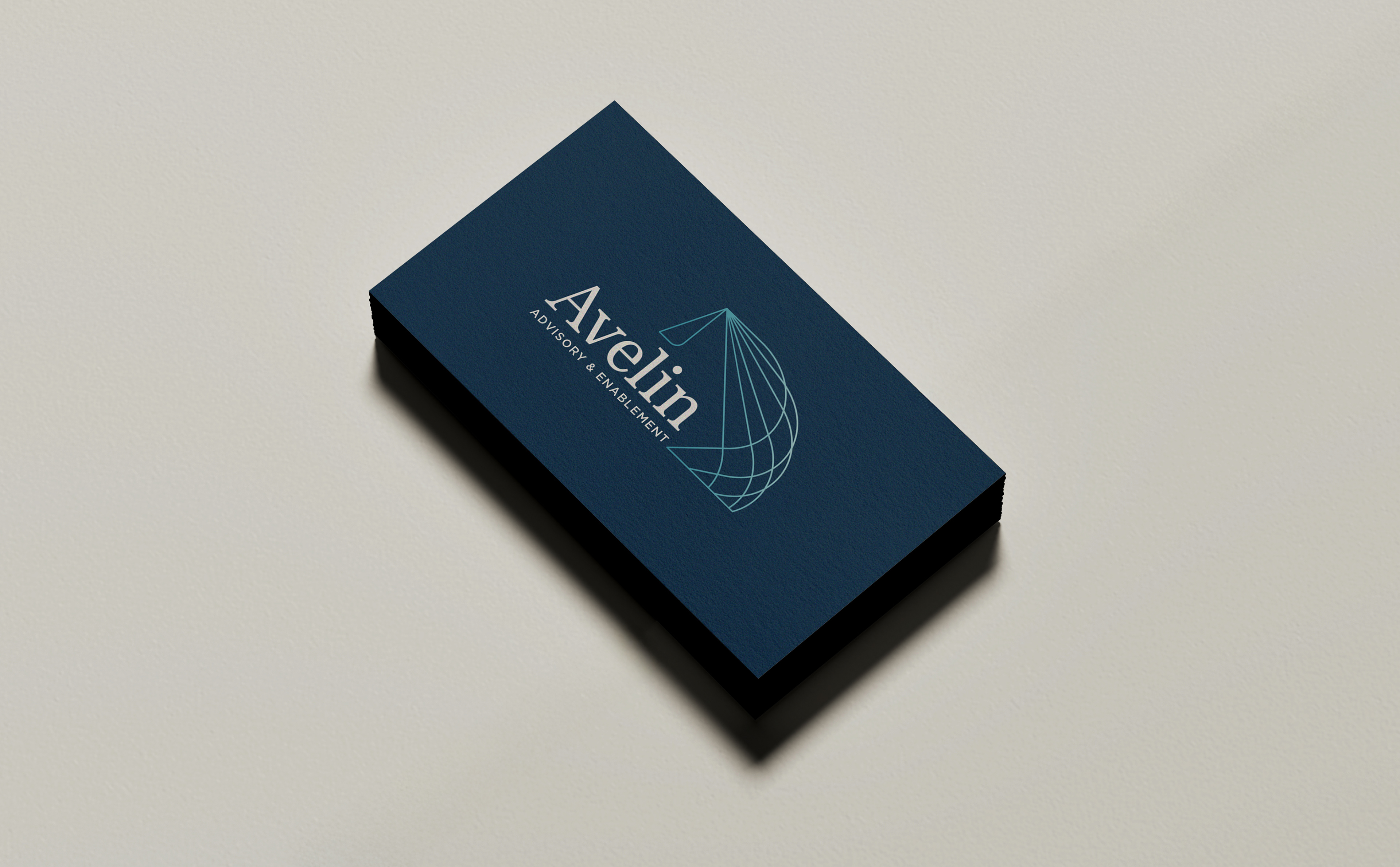
THE AVELIN BRAND MARK
Built on the interplay between the mainsail and spinnaker, the Avelin brand mark expresses dual mastery and forward acceleration. Together they form a linear ‘A’, with the aligned ‘L’ acting as the mast, a quiet reference to intelligent flow and precision.
THE AVELIN WORDMARK
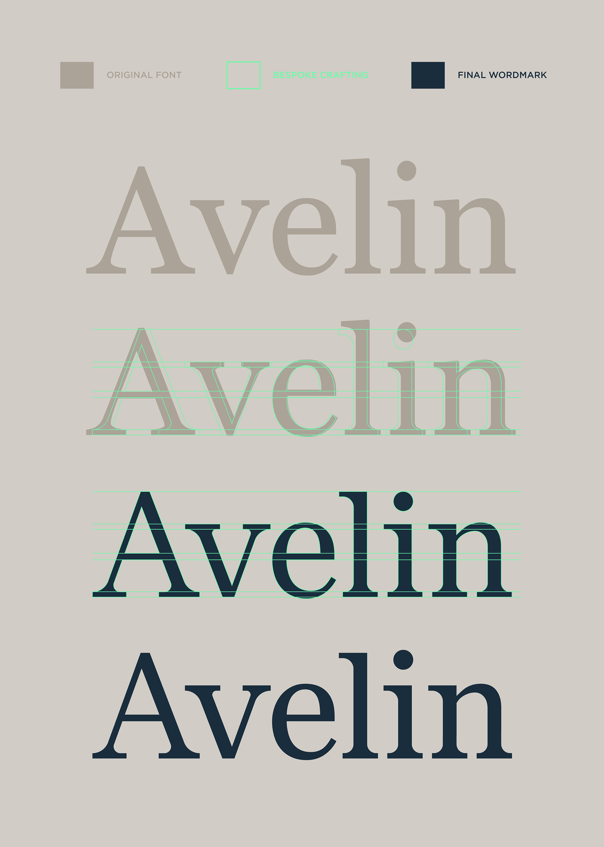
The Avelin wordmark was carefully reworked. Small, considered refinements to weight, spacing, and letter proportions create a quieter sense of balance and flow, resulting in typography that feels intentional, natural, and distinctly its own.